https://www.surveymonkey.co.uk/r/BZDQCJP
Saturday, 11 November 2017
Thursday, 9 November 2017


College TV Production Idea 1 Pitch.
This particular idea for the College was the initial idea for the TV show before branching off and creating alternate ideas, a possible title for this production is College TV. It has the target audience of young adult/students as that is the main demographic of the college.
Firstly the majority of the show will be filmed live in the studio, this will feature the college news, upcoming events and most importantly the presenter introduction. The college news could possibly feature inserted videos expanding on the story but it is intended to be for headlines early.
For the Top 5 films and music track segments I plan for them to be around two-and-a-half minutes long and pre-recorded in front of a greenscreen.
I plan for the opening titles to have a fast paced theme tune and to use graphics.
For the on location segments we will have one or two reporters, depending on the subject of the news, and they will possibly interview local business owners about NUS cards or anything college related.

College TV Production Idea 2 Pitch.
Like the previous idea the target audience for this production is young adults/students as this is the main demographic of the college.
The presenters of the show should have a smart-casual attire and have semi-casual body language. They will deliver the college news headlines before cutting to a segment that is pre-recorded. The presenters will be filmed live in the studio.
The design for the studio will have the primary colour of dark red with a greenscreen background which will display an image related to the story. A possible story for the first episode could be an introduction student union and instructions on how to apply for an NUS card. This could involve investigative interviews with businesses about student discounts and with student support services on how to apply for an NUS card.
A possible frequent location for segments could be Tonbridge park.

College TV Production Idea 3 Pitch.
The target audience for this production (named West Kent College News) is students as that is the main demographic of the College where the production will be aired.
The presenters (one male and one female) will be wearing smart attire behind a desk that would have mugs with either the college logo or the logo of the show (to be designed.)
This production will feature adverts for various aspects of the college such as the Hair and Beauty salon or Artisan Restaurant that’ll play between segments with logos in the corner during the rest of the production.
Tuesday, 7 November 2017
Have I Got News For You Analysis
https://www.youtube.com/watch?v=aByPw403hXM
Have I Got News For You is a BBC satirical quiz show.
The host changes week to week and on the episode I watched it was hosted by Jo Brand. She is wearing casual clothes and her hair is dyed pink. Whilst those on the left are dressed smart and those on the right are dressed smart-casual.
The background of the set have faked newspaper clippings that are comical which ties into the fact that it is a satirical show and thus is comedic and topical. Every few series they change the backgrounds to keep them more related to current affairs.
The shot type on Jo is a close up and the shot type for the panellists are in mid-range shots but go to close-up when they are speaking.
On the set at the desk where the host sits, there is a counter of points, not that it applies heavily to the show.
With the editing the show cuts away to extracts from newspapers and photos, the background is red and has a newspaper motif, tying into the fact that this is based on the news.
Thursday, 2 November 2017
Creating an Interview
To create an interview it is ideal to initially inform the interviewee of the questions and to tell them what you want to get from them from the interview. You must also give you time to set up as it always takes longer than anticipated.
The interviewer should set up the camera beside them of behind them in an over-the-shoulder-shot. The camera must remain within the 180 degree rule this is to avoid confusion for the audience.
 It is important to retain eye-contact for the comfort of the interviewee and to stop them from looking directly into the camera and keeping their eyes from darting around.
 Some interviews will also feature cutaways of the interviewer nodding and asking the question. This helps to pad out the interview and make it more layered.
The interviewee should be wearing a lapel microphone so that everything they say can be heard.
It is important that the interviewee is in the middle of the screen with a close-up of them, making sure there is a gap between their head and the top of the frame.
The interviewer should set up the camera beside them of behind them in an over-the-shoulder-shot. The camera must remain within the 180 degree rule this is to avoid confusion for the audience.
 Some interviews will also feature cutaways of the interviewer nodding and asking the question. This helps to pad out the interview and make it more layered.
The interviewee should be wearing a lapel microphone so that everything they say can be heard.
It is important that the interviewee is in the middle of the screen with a close-up of them, making sure there is a gap between their head and the top of the frame.
Tuesday, 31 October 2017
Audiences
Audiences are highly important to all media texts as without an audience the media text will not have success and not make a profit. Considering the audience aids producers in setting parameters to aid targeting the audience through casting, plot or even the opening of the tv show/film.
Demographics are characteristics that are targeted by the media industry. Demographics are characteristics there are fixed. Some examples would be: Ager, gender, nationality/regionality and socio-economic status.
The national readership surgery displays socio-economic status in A to D with A being the richest and D being people with the lowest income (unemployed, students, pensioners)
An audience is either a singular consumer or a group of consumers of a media text. Media organisations produce media texts in order to make a profit and without an audience they won't make a profit at all.
Due to an increase in technology mass-media is more competitive than it was thirty years ago with the introduction of more TV channels, radio stations, newspapers, magazines and in more recent years the internet with digital media like on demand services such as BBC iPlayer and Netflix.
Old media such as TV, radio and print (newspapers, magazines and books) used to have a higher audience but with the introduction of digital media audience has become fragmented, meaning that the audience for something has been separated, for example one part of an audience for a TV show would watch it when it airs whilst another part would wait until it is on demand (iPlayer, ITV player, All 4).
There are two types of audience, mass and niche.
Mass audiences are those who consume mainstream or popular media texts such as soaps, sitcoms, reality tv or popular film franchises.
Those targeting these mass audiences have to think about a large group of people with multiple factors (women, men, children, adults.) Examples of texts targeting a mass audience would be:
- BBC News
- The Guardian
- Antiques Roadshow
- The One Show
Niche audiences are much smaller and restrictive audiences but very influential. A niche audience is more select and a collective of those with a unique interest.
Examples of texts targeting a niche audience would be:
- Bird watching magazine
- Walking with Dinosaurs
- Trekkies (documentary)
Demographics are characteristics that are targeted by the media industry. Demographics are characteristics there are fixed. Some examples would be: Ager, gender, nationality/regionality and socio-economic status.
The national readership surgery displays socio-economic status in A to D with A being the richest and D being people with the lowest income (unemployed, students, pensioners)
White Balance
White balance is the act of giving the camera a reference of "true white" meaning the camera can give a fully colour balanced shot. Giving the camera a reference of white means that it will record white correctly, thus will record all colour correctly as white is all colours.
It is important to white balance whenever the lighting conditions change, especially for going from shooting indoors to shooting outdoors. This is also important for early morning and late evening as the light colour changes quickly, despite our eyes not noticing, the cameras do.
To perform a manual white balance you must first make sure that your camera is set to the correct filter for lighting technicians. Then you should point the camera at a pure white subject, ideally a plain white sheet of paper as it is matte, thus non-reflective.
Then you should set your focus, followed by activating the white balance button. This should take a few seconds and your camera will inform you when it has completed the process.
In our lesson we also experimented with changing the colour of the shot by exploiting the white balance setting.
The process is almost the same but rather than using a piece of white paper you use a coloured gel (normally intended for lighting) or a coloured piece of paper. However the colour of the paper will not create the same colour for the shot but rather the opposite, so a blue sheet of paper or gel would result in the shot being warm (red or orange) whilst a red gel or paper would result in the shot being cold (blue).
The results of using green is a purple or pink shot and vice-versa.
Thursday, 19 October 2017
Final Evaluation of Foley Project. (Updated)
In the recent weeks, Stuart has set us a group task to provide sound effects to the iconic "shower scene" from Alfred Hitchcock's Psycho using Foley methods.
Foley is a sound effect technique named after sound effects artist Jack Foley. It is where you take everyday objects and attempt to create sounds that match what is shown on screen.
Two weeks ago we had a Foley workshop set up by Stuart where we had a range of items to use, for instance there were several cabbages and a knife to aim to recreate the stabbing sound as well as rice which my group used to try and recreate the sound of shower water. There were also balloons which we used to try and make sound like Marion Crane, (the woman who was murdered) sliding against the bathtub by rubbing the balloons. However this didn't go so well and did not have the desired result. On the contrary the rice being poured went successfully and sounded close enough to shower water to be deemed a success.
My group in particular did not have to resort to found content, however if we did need to we would have to use it sparingly and give credit as it is plagiarism.
The editing software used to apply the sound effects was Adobe Premier Pro, as I and two others in my group (Megan, Jess and Alice) have had previous experience with Premier Pro we found it easy to use. We managed to apply sound effects for walking, a door closing, the shower and humming/singing.
Sadly the software crashed and it is currently unknown if any of the work survived, therefore in the next session we need to check the damage and re-do anything that was lost, most likely on a different computer.
I feel the final product is a good first attempt. The syncing of the majority of sounds such as the door, footsteps, the shower, the shower curtains and the water rushing down the plug all sync successfully however the sounds of the screams didn't sync properly and were choppy and cut-up, I don't know why this is but if I had more time I'd correct it.
Overall I enjoyed the audio production, despite finding some parts of the editing tedious. I enjoyed the recording of all the sounds and found that the majority were useful. The sound that worked best was the pouring of the rice and I used this to replicate the sound of the shower, the sound of the rice worked well as it sounded similar to water and was constant and flowing like that of water from a shower.
The feedback I received were generally along the same lines, many said that the sound effects were good however it would have been even better if the sound of the screams were properly synced. I whole heartedly agree with this criticism.
Tuesday, 17 October 2017
Week 5 Photography Lighting Workshop Summary.
On Thursday the 12th of October during week 5 of the UAL Media Studies course we were given a lighting worship where we experimented with lighting for film and photography.
We were taken into the studio where there were four different lighting set-ups, three were 3 points each using different types of lights, Arri 300s, dedo lights and redheads and the fourth set-up was a horror set-up using Arri 300s.
The three different lights have different brightness levels. The Dedos are the smallest and least bright, they also feature a slider to adjust the brightness. The middle brightness were the Arri 300s and the brightest ones are the redheads.
The redheads use 2400 watts, the Arri 300s use 900 watts and the dedos only use 450 watts.
All of the lights were nice and easy to use safely, once being briefed on the health and safety aspects.
As the lights get very hot it would be dangerous to handle them without gloves as you'd risk being burned by the sheer heat of all the lights, in fact even with the gloves you could feel the heat of all of the lamps and couldn't handle them for long. Another health and safety risk with the lights, especially the redheads is that the extension leads need to be pulled out fully or else they could catch fire due to the immense amount of electricity going through the wires.
We were separated into four groups and in our groups given different roles such as operating the camera, being the model, operating the lighting and taking photos of the whole process. We all changed roles and tried everything and overall the experience was good and taught us a lot about the importance of lighting and how to set up lighting.
Thursday, 12 October 2017
Summary of Carousel Week 5 Photography
On Tuesday the 10th of October for week 5 of the carousel we were in a photography workshop.
We covered two processes of photography, taking photos with different shutter speeds and taking photos with different apertures.
We gathered evidence in two different ways
Our Primary evidence was us going out in small groups and taking photos using different shutter speeds and aperture settings. In the first session we were to take pictures capturing movement for example capturing falling leaves or people jumping, even Alice in her wheelchair moving. The effect caused was a blur when using a low shutter-speed and with a high shutter-speed the image was crisp.
In the second session we were tasked with changing our aperture size and taking photos in the garden by the college. The larger the aperture, the more light goes through and the less in-focus everything is in whilst with a smaller aperture more of the subject is in focus.
The method of changing the aperture and shutter-speed is by first turning the mode dial to the S (for shutter speed) and then turning the main command dial on the camera to change the speed of the shutter and to then press the shutter release to take the photo.
The method of changing the aperture is similar but rather than having the mode dial on S it is rather set to A.
The camera used was a Nikon D3200.
 |
| Nikon D3200 |
Wednesday, 11 October 2017
Soundtrack analysis of Han Solo's death from Star Wars The Force Awakens
In the now iconic scene from Star Wars The Force Awakens where Han Solo, fan favourite character is killed by his son, Ben AKA Kylo Ren.
The soundtrack from the scene is complex, using not only music and dialogue but also ambient sound and sound effects.
The score of the scene the music is low pitch and atmospheric, this helps to build tension for the inevitable confrontation between Han and Kylo. What also aids this is the slowly paced rhythm of the score at this point.
When Han shouts the name of his son the score halts for a brief moment. This helps to take the audience out of the moment for a bit to allow the information of Kylo's real name to sink in. This too also aids in building tension. As Han walks to his son the score slowly begins to crescendo, the music itself is orchestral, mainly string instruments. The tempo is still slow, the timbre is sad, preparing the audience for what is to come.
Finally following Kylo killing Han there is a sting of shock accompanied by the cries of Rey and Fiin and the roar of Chewbacca. This sting reflects the feelings of the audience and characters alike, following the sting the score becomes empathetically mournful and continues as we cut to Leia feeling the death of her husband through the force.
In this scene's soundtrack there isn't much ambient sound however there is still some to note.
For instance the low mechanical hum of a generator can be heard, this informs the audience that the scene is set in a room with generator rooms and thus must produce power for the base.
When Han and Ben are atop the walkway you can faintly hear the sound of wind, this adds to the illusion that the two are high up. The sound of wind also adds to the emptiness of the entire room and almost makes it seem like the father and son are alone despite not actually being alone.
The dialogue given in this scene is empathetic. The timbre of Han's voice is loving and caring, something that is typically contrapuntal to Han's character as he is usually portrayed as a man who only cares for himself and his own gain. The fact that Han's tone is caring shows that he loves his son and wishes for him to return home, he even states this himself. It is in contrast to how Kylo views his father, he sees him as a man who wasn't there for him as a child. At first his voice carries tones of anger when he exclaims, "Your son is dead" however as the dialogue continues the tone becomes sadder as he realises what he has to do. This shows us that he doesn't truly want to kill his father, however his master told him that it would indeed make him become more powerful.
The soundtrack of this scene contains many sound effects, the majority of which were likely added in post, some for example the sound of Han's footsteps were likely done using foley techniques rather than being recorded on-set.
Once such sound effect used in this scene is a the sound motif of Kylo Ren's lightsaber, unlike most lightsaber noises, Kylo's is more warped and raw, this is due to the fact that it is broken. The use of this different sound effect for Kylo's lightsaber helps us identify that it is specifically his, it could also be a parallel to Kylo's character and the fact that he is a warped form of his former self whilst Rey's (Or Anakin's, or Luke's) lightsaber's sound is more basic and simple, showing how she has not been corrupted by the dark side.
Thursday, 5 October 2017
Review of 4 Hippies in space and a Bic Pen
Today on the 3rd of October for our creative studies carousel we were set the task of producing a mock advert for a Bic 4 colour pen. We were separated into four groups to brainstorm ideas and then there is a vote to find which idea will be produced.
The idea that was selected to be produced was about four hippy astronauts who were in a space ship flying to the moon, one of the hippies has a treasured 4 colour Bic pen. Upon arrival to the moon they are confronted by an alien who threatens the hippies with death if they don't hand the pen over to them.
Personally I felt the production of the advert was mis-managed, we struggled with teamwork and despite Kian the director having a vision of what he wanted to create he wasn't that great at showing the rest of us what to do.
Another problem with the production was how limited we were with resources and having to do it as a live edit meant that we couldn't use a green screen, thus would struggle with creating the illusion of being in space, however to my surprise it was a success and ended up feeling almost like an old episode of Doctor Who or Star Trek. Another positive was the non-diegetic sound effects, the actors did not know when the effects would play and were essentially blind but in the final edit the sound effects synced almost perfectly and gave a satisfying feeling. I myself set up half of the lighting and I am pleased with my results, the lighting in the video is low-key however colourful, using red, blue, green, orange and pink, the first three of those colours are featured on the Bic pen, whether this was the intention of the director or not I do not know but it feels satisfying and is aesthetically pleasing.
I have a few complaints about the finished video, for instance the transitioning of cameras isn't well timed and could be improved, it feels off and wrong, I can't fully articulate my grievance with the transitioning. Another issue I have with the final edit is how it doesn't fully feel like a proper tv advert. It doesn't have many conventions of a standard advert, the only thing we learn about the product is that it is a pen with four different colours and it can apparently kill aliens. I wish it could elaborate more on why the product is worth buying, possibly how many people use it as a fidget toy or how the 4 colour biro is the most stolen pen.
The idea that was selected to be produced was about four hippy astronauts who were in a space ship flying to the moon, one of the hippies has a treasured 4 colour Bic pen. Upon arrival to the moon they are confronted by an alien who threatens the hippies with death if they don't hand the pen over to them.
Personally I felt the production of the advert was mis-managed, we struggled with teamwork and despite Kian the director having a vision of what he wanted to create he wasn't that great at showing the rest of us what to do.
Another problem with the production was how limited we were with resources and having to do it as a live edit meant that we couldn't use a green screen, thus would struggle with creating the illusion of being in space, however to my surprise it was a success and ended up feeling almost like an old episode of Doctor Who or Star Trek. Another positive was the non-diegetic sound effects, the actors did not know when the effects would play and were essentially blind but in the final edit the sound effects synced almost perfectly and gave a satisfying feeling. I myself set up half of the lighting and I am pleased with my results, the lighting in the video is low-key however colourful, using red, blue, green, orange and pink, the first three of those colours are featured on the Bic pen, whether this was the intention of the director or not I do not know but it feels satisfying and is aesthetically pleasing.
 |
| Megan on camera 4 |
I have a few complaints about the finished video, for instance the transitioning of cameras isn't well timed and could be improved, it feels off and wrong, I can't fully articulate my grievance with the transitioning. Another issue I have with the final edit is how it doesn't fully feel like a proper tv advert. It doesn't have many conventions of a standard advert, the only thing we learn about the product is that it is a pen with four different colours and it can apparently kill aliens. I wish it could elaborate more on why the product is worth buying, possibly how many people use it as a fidget toy or how the 4 colour biro is the most stolen pen.
 |
| The Beta set |
Monday, 2 October 2017
Psycho Shower Scene Foley Activity.
In the recent weeks, Stuart has set us a group task to provide sound effects to the iconic "shower scene" from Alfred Hitchcock's Psycho using Foley methods.
Foley is a sound effect technique named after sound effects artist Jack Foley. It is where you take everyday objects and attempt to create sounds that match what is shown on screen.
Two weeks ago we had a Foley workshop set up by Stuart where we had a range of items to use, for instance there were several cabbages and a knife to aim to recreate the stabbing sound as well as rice which my group used to try and recreate the sound of shower water. There were also balloons which we used to try and make sound like Marion Crane, (the woman who was murdered) sliding against the bathtub by rubbing the balloons. However this didn't go so well and did not have the desired result. On the contrary the rice being poured went successfully and sounded close enough to shower water to be deemed a success.
My group in particular did not have to resort to found content, however if we did need to we would have to use it sparingly and give credit as it is plagiarism.
The editing software used to apply the sound effects was Adobe Premier Pro, as I and two others in my group (Megan and Alice) have had previous experience with Premier Pro we found it easy to use. We managed to apply sound effects for walking, a door closing, the shower and humming/singing.
Sadly the software crashed and it is currently unknown if any of the work survived, therefore in the next session we need to check the damage and re-do anything that was lost, most likely on a different computer.

Saturday, 30 September 2017
Title : Critically Comparing my Skills, Processes and Methods
1st. Formulate your question:
Look below at what you are you being asked to evaluate.
Unit 1
U1.2.1 Critically compare a range of communication methods used to convey meaning in creative media production.
Note Critically is similar to compare but concentrate on the things that are different with two or more methods used or what sets them apart. Point out any differences which are particularly significant.
In your own words say what U1.2.1 is asking you to do.
Answer: To critically compare a range media products.
2nd. Gather your information:
What have you been doing that you can evaluate
On your blog you now have two weeks detailing classes in The Carousel and professional ways to use tools, skills, processes. If you have details of these you have done this point just add the links below.
Blog link to last week:
Blog link to this week:
3rd. Apply the information
How well have you done in the sessions?
Ask yourself:
- Which skills, Processes and Methods or tools you enjoyed the most?
Answer: Mono-printing, making thick lines that look like they were made by a 2B pencil resulting in a black-and-white print.
- Which of the things you have been shown could you demonstrate to another person?
Answer: Drawing still life, juxtaposing colours of red and blue.
- Which of the things you have been shown do you need more practice with?
Answer: Drawing using a biro and also using charcoal.
4th. Consider the implications
If you were asked by a professional to use some of the tools, skills, processes how well would you do?
Answer: If I was asked by a professional artist to draw from life I feel I may struggle as my drawing technique is imperfect and I could use some practice.
5. Explore other points of view
Have you considered feedback from teachers and Peers as to how well you did in the session, if so what feedback have you had?
Answer: No
What Feedback have you had so far that tells you you are doing okay in the session?
Answer: One of the fashion tutors told me that my fabric looked good.
Thursday, 28 September 2017
Week 3 Second Evaluation of the Carousel
 |
| Cartridge paper |
With primary research we did the dyeing on our own and secondary research was being told how to dye the fabric.
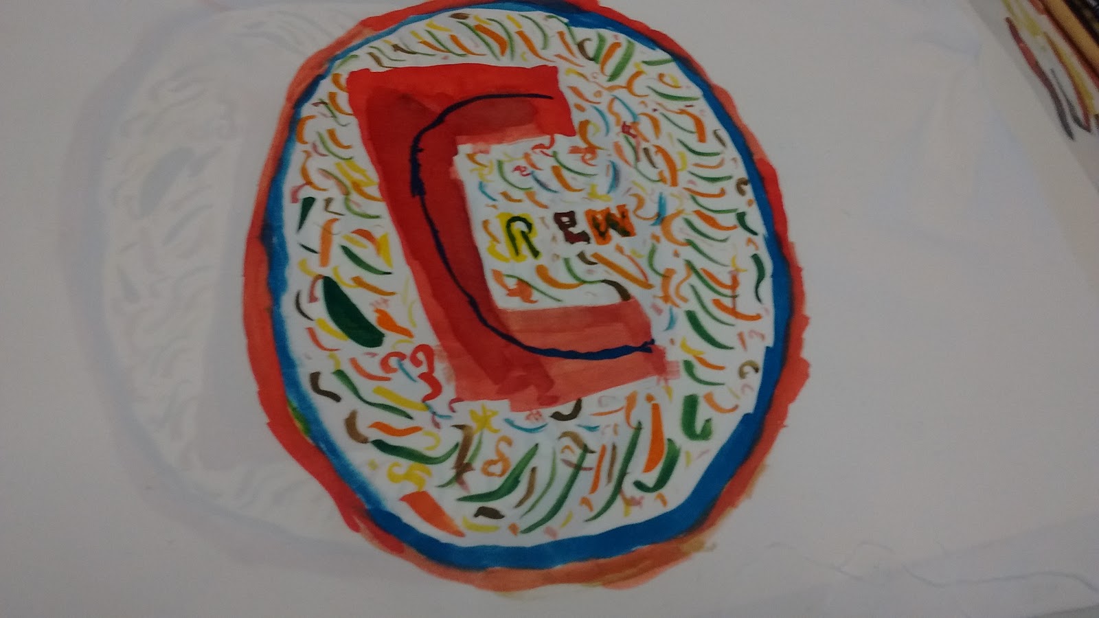
A skill I tried was painting disperse dye on to cartridge paper using a brush, something I'm not used to. We had to create a logo for a crew shirt.
The process I did was printing on fabric with disperse dyes, the method for it was to first paint an outline of our logo in reverse (this is because when the dye was printed it would print a mirror image of what we has painted). Then we painted the disperse dyes on to the cartridge paper, for me it took around forty to fifty minutes to fully paint this. I then took my dried cartridge paper to the heat press(which is set to 180 degrees Celsius) and placed my cartridge paper with a plain sheet of polyester into the heat press for 60 seconds.
The end result was a fully printed logo.
The tools I used were: Paintbrushes, a heat press, pencils and a paint holder whilst others in my group also used embroidery hoops and sewing machines.
 |
| The finished fabric |

Wednesday, 27 September 2017
An Introduction to the Nikon D3200
The Nikon D3200 is a Digital SLR camera produced by the Japanese company Nikon.
tHE D3200 is relatively pricey at around £300, it has a maximum focal length of 55mm and a minimum focal length of 18mm.
 |
| The D3200 |
The D3200 is reportedly easy to use and ideal for people new to DSLRs like myself.
Saturday, 23 September 2017
Analysis of Rogue One: A Star Wars Story Scene.
Analysis of Rogue One: A Star Wars Story, Krennic meets Vader.
Technical Codes
One technical code seen within this scene is the use of a slight zoom when Vader uses the force to choke director Krennic. This helps to show us the shock on Krennic's face as he realises that he cannot breathe and we can see the fear on his face. This also reminds us that Vader is a threat, even to those on the same side as him.
Another example of a technical code used is an over-the-shoulder shot when Vader confronts Director Krennic about the use of the Death Star on the City of Jedha. The purpose of this shot is to display how Darth Vader towers over Krennic in both stature but also in authority.
A third technical code is the use of a downward tilt when Krennic walks into a chamber, this shows us the grandness of Vader's castle and how high the ceilings are in this one room. It could also be used as an establishing shot to set the scene for their confrontation.
The scene uses a long shot when the door which Vader is behind lifts up, this is to help with the understanding of the set and show the audience the grandness of Vader's castle.
A final technical code used in the scene is a circular tracking shot of the two characters on a platform where they are having their conversation. This has a similar purpose as a long shot. It is used to display more of the setting and to also make the audience feel more involved in the action
Visual Codes
A visual code used within this scene is the costumes of both Vader and Krennic. Vader's costume is black and technologically advanced whilst Krennic's costume is white and plain, with the exception of his cape. The purpose of this is to display their binary opposition, despite being them both being on the side of the Empire they oppose each other. Vader in fact opposes the Death Star and finds it a waste of the Empire's money and time whilst Krennic, director of the entire Death Star project saw it as entirely necessary.
A second visual code is the use of the colour black used in Darth Vader's castle and his costume. Black has connotations of evil and death, both characteristics perfectly reflected by vader himself.
Another visual code of colour in the scene is the fact that Krennic wears white. White has connotations of perfection which matches with Director Krennic's need for perfection of his project, the Death Star.
A minor visual code seen is the iconography of the door which Vader exits from. The door itself is the same trapezium shape as the vent on Vader's helmet, the meaning of this is to show that this fortress is indeed Vader's and was built specifically for him.
Towards the end of the scene Vader uses a pointing gesture towards Krennic in whilst ordering him to not fail again, this is to show Vader's anger towards Krennic as his mask shrouds his face.
Audio Codes
An audio code used in this scene is music, specifically a slower rendition of John William's Imperial March that has come to represent Darth Vader, the music is intimidating, as to reflect how intimidating Darth Vader himself is. It is played before we even see Vader in his suit and thus informs us that we will see the sith lord in all his glory.
Another audio code heard within this scene is the sound effect heard when Vader force chokes Krennic. It sounds as if the air is being forced from his lungs. The effect of this is to inform us that he is being choked as the sound effect is notorious in the Star Wars films and is memorable.
Finally the most important audio code used in this scene is dialogue between Darth Vader and Director Krennic, this is used to convey the thoughts and feelings of both characters involved in the scene and to inform the audience about what it occurring.
Thursday, 21 September 2017
Week 2 First Evaluation of the Carousel
1. Evidence of me taking part: (Pictures, Diary entries, Printouts ETC) U1.1.2
 |
| The complete sheet of my drawings. |
2. Write up your experience of the following...
Now list Primary and Secondary sources U2.2.1
Primary: We had to test out drawing with both a pencil and a pen. From there we had to choose which one to use.

Secondary: We also looked at past student artwork to see what they would've drawing had used that to inspire our own sketches and drawings.
2b Discuss any skills that you have tried: U2.1.1
We tried multiple artistic skills such as drawing with a broad tipped pen and then applying water with a brush in order to cause it to bleed. All our drawings were still life drawings (drawing from something real) which in of itself is a skill. Another skill I tried was using two different pens to draw the jaw bone. I used a blue and red biro to create this.
 |
| The result of bleeding the ink (highlighter added) |
2c Discuss any processes and methods you used (Photography wet process, Screen Printing, Photoshop layering etc): U1.1.1
What is your understanding of these?:
Processes
What is your understanding of these?:
Processes
The two main processes I practiced was: drawing still life and mono-printing.
Methods
Methods
I used a variety of methods in order to draw still life. For instance one method was drawing was using two different pencils held together to draw one drawing and other was using a highlighter to bring out the lines. The method I used to mono-print was to put a pea-sized blob of black-oil based ink on to the glass workbench, then I used a large roller in order to spread and flatten the ink on the desk. Once the ink was evenly spread I placed a sheet of newsprint paper with a photograph of an object stuck to it. I traced the lines of the photo and eventually lifted up the paper to reveal a mono-print.
 |
The roller I used to spread the ink.
|
 |
| The finished mono-print of a shell. |
2d Discuss the tools that you used (Paint, Material, Software, etc): U2 3.1
Evaluate them
How effective are they?
Some tools such as the pencils I used were highly effective in creating a basic, neat sketch, this may be due to me having experience with using them to draw. However I struggled when using the pens to draw without pencil line-art to use as a basis. It was a method almost alien to me as usually when I draw I always draw in pencil first.
With the mono-print I was surprised to see that it wasn't as dark as I had expected, it looked as if it was drawn with a pencil, rather than a pen.
How could this be improved?
With the use of pens to draw quickly, to improve I could practice a lot more and even try to use different types of pen. I never used a biro to draw whilst in art and design as I used my own fine liner.
Subscribe to:
Comments (Atom)